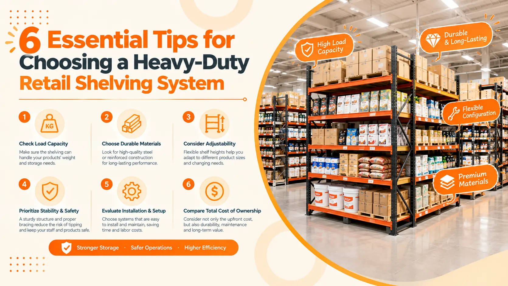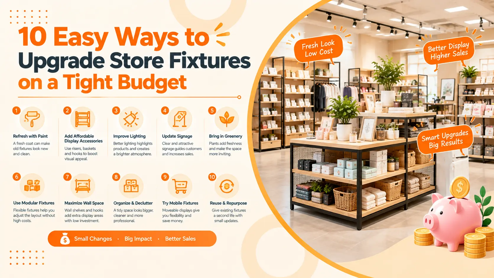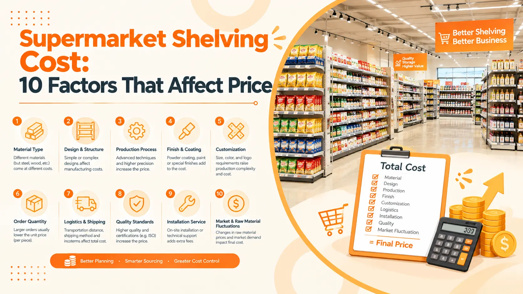
Beauty shoppers often enter a store with a mood, a skin concern, a shade idea, or a gift need. They may not have a fixed SKU in mind. Sephora-style layouts are built for that moment. They turn loose browsing into a series of small product decisions. Those ideas can be adapted for cosmetic stores, pharmacies, boutiques, and beauty zones inside larger retail formats.
Key Takeaways
- 92% of surveyed shoppers sometimes, usually, or always buy items they did not plan to buy.
- Open-sell tester bays work because shoppers can touch, compare, and choose without waiting for staff.
- Gondolas, end caps, and checkout minis create repeat impulse zones across the whole beauty store.
- Smaller stores can copy the logic through modular fixtures, clean sightlines, and tight tester-to-stock placement.

Why do Sephora-style layouts create more unplanned purchases?
92% of participants in a 2026 survey said they sometimes, usually, or always purchase items they did not intend to buy (RSPA, 2026). A Sephora-style floor plan takes that open decision state seriously.
A counter-service beauty store slows the shopper down at the wrong moment. The customer has to ask for help, wait for a product, and decide while someone is watching. That model can work for luxury consultation. It is much weaker for casual discovery.
Open-sell beauty retail removes some of that pressure. A shopper can pick up a mascara, compare three lip shades, smell a fragrance, or test a moisturizer texture without turning the moment into a sales conversation. The fixture does part of the selling.
The store still needs discipline. Open-sell does not mean random abundance. It means controlled abundance: many products are visible, but categories, colors, lighting, and fixture edges tell the shopper where to look next.
Sephora-style layout is not mainly about black shelving, bright mirrors, or luxury mood. The useful lesson is more practical: shorten the distance between curiosity and action. Let the shopper see it, touch it, test it, compare it, then pick it up.
For a cosmetic store buyer, this changes the fixture brief. A good cosmetic store display design should not only look clean on opening day. It should keep testers visible, stock close, signs readable, and replenishment simple after hundreds of shoppers have handled the products.
How does open-sell beauty merchandising reduce purchase hesitation?
35% of consumers are more likely to make impulse purchases in-store, according to Capital One Shopping’s 2026 impulse buying statistics. Open-sell beauty merchandising catches the shopper while interest is still fresh.
The main rule is tester-to-stock adjacency. If the tester is on the top tray but the sellable product is two meters away, the store has added work. The shopper must remember the shade name, search the shelf, and check packaging. Many small impulse buys die there.
A stronger layout keeps testers, shade families, mirrors, price labels, and sellable units in one compact field of view. The customer can test, confirm, and take the product from the same bay. That sounds simple. On the shop floor, it depends on precise fixture planning.
Tester trays should be shallow enough to scan. Lip, eye, and complexion products need dividers that keep shades upright and readable. LED strips should illuminate the product face without glare. Staff need enough access to clean testers and replace broken trays.
| Fixture format | Product access | Comparison speed | Staff dependency | Impulse purchase fit |
| Locked beauty counter | Low | Slow | High | Best for assisted luxury sales, weaker for casual add-ons |
| Assisted wall display | Medium | Medium | Medium | Useful for guided browsing when testers and stock are nearby |
| Open-sell tester bay | High | Fast | Low | Strong fit for makeup, skincare minis, fragrance trials, and routine add-ons |
In cosmetic fixture planning, the weakest tester bays are usually not ugly. They are inconvenient. The tester sits too deep, the product code is hard to read, the drawer blocks staff knees, or the lighting makes a foundation shade look warmer than it is. Those details decide whether customers keep browsing.
That is where custom cosmetic store fixtures matter. The shop drawing should show tester depth, mirror location, tray replacement, cable routing, lighting position, and staff-side access before production starts.
Why are gondola runs so effective in beauty retail?
In beauty retail, sightlines sell. A shopper should see the next makeup zone, fragrance story, service area, and checkout path while browsing. Fill the center with tall fixtures and the floor becomes harder to read.
Mid-height gondolas solve that problem. They create two-sided merchandising in the center aisle, keep products at hand level and eye level, and leave enough visual openness for shoppers to keep exploring. They also turn aisle ends into natural campaign points.

Sightlines matter more than shelf count
More shelves do not always mean more selling. If a fixture blocks visibility or makes product families hard to compare, the store may gain capacity and lose impulse value. A better planning question is sharper: which product should the shopper notice next?
For beauty chains, gondola runs can hold brand blocks, new launches, routine builders, and mini categories. For smaller stores, one central gondola shelving system can carry bestsellers on one side and seasonal discovery on the other.
Sephora’s 2025 redesign shows why fixture agility matters. Retail Dive reported that the company is testing formats that are easier to update, including more modular minis fixtures. For a beauty retailer, a fixture that can shift from fragrance minis in November to sun care in May is worth more than a fixed display built for one campaign.
Where do end caps create the strongest beauty impulse buys?
Beauty end caps work best when they present one simple buying theme, such as new arrivals, travel sizes, seasonal color, or giftable sets. RSPA reported in 2026 that over 60% of shoppers said retail displays influenced their choice when comparing similar products or brands.
Beauty end caps perform especially well at three points. Place them near the entrance to introduce newness. Place them at category transitions to suggest add-ons. Place them near checkout or consultation areas to catch shoppers who are still considering one more item.
The best end cap shelving for beauty impulse buying has a strong face, lighting that does not distort color, and enough stock depth to avoid looking empty after a busy weekend. It also needs fast graphic replacement, because beauty campaigns change quickly.
Five beauty end cap themes worth testing
New arrivals make sense near the entrance. Mini and travel sizes work near checkout. Seasonal color belongs where shoppers can compare it with core shades. Giftable sets work during holiday traffic. Routine builders work between categories, such as cleanser beside toner and moisturizer.
If the product story takes more than one small sign to explain, it is probably too complicated for an end cap. Keep the decision small.
How do checkout minis turn waiting time into basket growth?
Retail Dive reported that Sephora’s familiar snake-style checkout line lets shoppers consider product minis while waiting, although 25% of shoppers are now checked out by beauty advisers through mobile checkout. That detail matters: the mini fixture must work even when payment moves.
Checkout minis sell because they lower commitment. A shopper may not buy a full-size fragrance today. A travel spray feels easier. A full skincare routine may feel expensive, but one cleanser mini can feel like a trial.
Price architecture matters here. Minis, beauty tools, sheet masks, hair accessories, and small gift kits work better when the shopper can understand the value fast. Clear bins, front-facing products, and simple price bands beat crowded novelty.
What belongs near checkout
Place trial sizes, routine add-ons, beauty tools, refill items, and giftable kits near checkout. Keep fragile products away from bagging space. Leave room for payment hardware, returns, staff movement, and shoppers holding baskets.
The better store layout strategy is flexible. If mobile checkout keeps growing, the impulse mini fixture should be able to move toward the entrance, a consultation point, or a central traffic path.
Checkout impulse fixtures should follow the shopper, not the cash register. That is the lesson hidden inside Sephora’s redesign work.
What can smaller beauty stores copy from Sephora?
McKinsey expects the global beauty market to grow 5% annually and reach $590 billion by 2030 (McKinsey, 2026). Smaller beauty stores do not need a flagship footprint to benefit from that demand. They can compete by improving product access, tester placement, and checkout add-on zones.
Under 50 square meters, start with one strong hero wall, one clean tester bay, and one compact checkout mini display. The store cannot hold every category equally, so the layout has to choose a strong first impression.
From 50 to 150 square meters, add one center gondola run and one rotating end cap. That creates a simple loop. The shopper sees the wall, moves through the center fixture, pauses at the end cap, then reaches checkout.
From 150 to 500 square meters, the store can support category zones: skincare, makeup, fragrance, hair care, tools, and seasonal campaigns. At this size, lighting plans and circulation widths become more important. A shopper should never wonder where the next category begins.
Copy the logic, not the look
A smaller store should not imitate a large beauty chain by filling the room with dark shelves. That can make the shop feel cramped. It can also hide products that should sell on sight.
Copy the operating logic instead: product access, shade comparison, category clarity, easy replenishment, and modular impulse points. Ask for store fixture shop drawings before production, especially if the store has columns, narrow aisles, or mixed skincare and makeup categories.
What fixture specs matter most for Sephora-style impulse merchandising?
Start with height. Fast-moving items should sit within comfortable reach. Center gondolas should preserve sightlines. Wall bays can go taller, but the product story should still be readable from the main aisle.
Depth comes next. Deep shelves can hold more stock, but they can also bury testers and make shade names hard to read. For makeup, shallow trays with clear dividers often sell better than deep flat shelves.
Lighting needs care. Beauty products depend on color. LED strips should brighten product faces without glare. If the fixture includes mirrors, test lighting from the shopper’s eye level, not only from the drawing.
Materials should suit both appearance and maintenance. Powder-coated steel frames handle repeat use. Wood finishes soften the store. Acrylic trays organize small SKUs. Tempered glass can work for higher-end displays, but it needs cleaning access and edge protection.
Manufacturing details buyers should ask for
Ask for shop drawings, material samples, lighting specifications, tester tray details, packaging method, spare parts, and QC checkpoints. If you source custom retail shelving from China, those details reduce mistakes before bulk production.
Use a fixture audit before approving a Sephora-style plan. Score each display type from 1 to 5 on access, comparison speed, cleaning, restocking, visibility, and campaign flexibility. A beautiful tester bay that scores low on cleaning or stock access will start slipping after the first busy month.
The best beauty fixtures support both selling and operations. They help customers discover one more item, and they help staff keep the store neat enough for the next shopper to do the same.
Frequently asked questions
Why do Sephora-style stores encourage impulse buying?
Sephora-style stores encourage impulse buying because products are open, visible, and easy to test. That behavior becomes more valuable when fixtures reduce hesitation.
What is an open-sell beauty fixture?
An open-sell beauty fixture is a self-service display where testers, product labels, mirrors, and sellable stock sit close together. It should help shoppers decide while interest is fresh.
Where should impulse displays go in a cosmetics store?
Impulse displays should sit at the entrance, gondola ends, tester islands, category transitions, and checkout queue.
Can small beauty stores use Sephora-style layouts?
Yes. A 50-150 sq m store can use one hero wall, a tester bay, a center gondola, and a checkout mini display.
Conclusion
Sephora-style impulse buying is not magic. It comes from product access, sensory testing, clear category blocks, strong sightlines, themed end caps, and small add-on decisions near checkout.
For cosmetic retailers, the fixture plan has to carry that logic every day. Testers need cleaning access. Shelves need the right depth. Lighting has to show color accurately. Gondolas and end caps need enough flexibility for seasonal changes.
Send DAHO your floor plan, product category mix, or hand sketch. Our team can prepare a cosmetic fixture layout, shop drawings, and a quote for your store project.

Ivy is a shelving specialist at DAHO, a supermarket shelving manufacturer in China. She shares practical knowledge on retail shelving design, metal and wood fabrication, and store display systems. She helps global retailers and wholesalers understand shelving structures and choose the right factory solutions.