IKEA retail display ideas help a small home-goods store when they let shoppers picture a product in use and then find it without a long search. The useful part is the display logic.
A compact homewares shop faces a real constraint. Products such as vases, storage boxes, linens, lamps, cookware, and baskets need context. Yet a 150 m² sales floor cannot sacrifice half its space to decorative scenes that shoppers cannot buy from. The strongest plan makes inspiration, stock, and replenishment work together.
Key Takeaways
- Use a clear sequence: inspire shoppers, help them compare, then direct them to stock or an order route
- Build fewer room sets, but make every featured item shoppable or orderable
- Keep centre fixtures low and put high-capacity adjustable shelving on the perimeter
- Confirm SKU dimensions, shelf loads, and replenishment paths before approving shop drawings
A room set and a decorative vignette are not the same thing. A vignette makes a good photograph. A room set earns selling space only when it answers a customer mission, identifies the products, and points to stock or an order route. That distinction keeps a small store from becoming an expensive showroom with nowhere to replenish from.

What can a small home goods store learn from IKEA’s retail display system?
In a small shop, display, stock, lighting, and staff access have to work together. Start with a believable use case. Then make product selection and stock access obvious.
Use a four-step path: inspire → compare → select → carry or order. The display attracts attention. A nearby shelf, item tag, or ordering point turns that attention into a decision. The route should feel obvious even if a shopper has never visited before.
Don’t copy a warehouse showroom if your back room and delivery model can’t support it. Bulky furniture may need one floor sample and a clear order process. Smaller accessories can sit beside the scene in a labelled shelf bay. Your product list, stock depth, and staff capacity should decide the format.
For a broader view of customer flow and fixture placement, start with a retail store layout strategy. The same principles of clear zones, sightlines, and replenishment apply beyond grocery stores.
| Stage | Shopper need | Small-store display response |
| Inspire | See a product in context | One compact room set with a clear customer mission |
| Compare | Touch, assess, and see options | Low table or nearby shelf with a limited assortment |
| Select | Find the exact item and price | Item tag, shelf-edge label, or staff-assisted order point |
| Carry or order | Complete the purchase | Adjacent stock, basket access, or a defined delivery process |
1. Why build one shoppable room set instead of several decorative corners?
One room set built around a real task gives shoppers useful context and protects floor space. For many compact stores, start by testing one 2–3 m scene for entryway organisation or apartment dining instead of maintaining several disconnected corners.
Choose a single customer mission. A compact entryway can show a bench, wall hooks, a basket, a mirror, and labels. A weekday-breakfast display can use a tray, mugs, storage jars, placemats, and a small lamp. The hero product creates the story; the supporting SKUs make the story commercially useful.
Every item needs a route. Add a discreet item tag, a small code, and a clear shelf or staff order point. Keep small accessories within reach. Place bulky samples where staff can explain lead times without blocking the aisle.
Pro tip: Set a product limit before styling a room set. If the display needs more than one hero item and 5–8 supporting SKUs to explain its purpose, the story is probably too broad for a compact floor.
In fixture planning, DAHO designers treat a room set as an operating zone. They ask where the next carton sits, how staff will reset the display, and whether shoppers can identify every product. Those questions catch a common failure: a display that looks complete on opening day, then becomes empty or confusing after a busy weekend.
2. How do low central tables keep a small store easy to read?
Low central tables protect a shopper’s view to the perimeter and back wall while providing a place to touch homewares. A low table or low two-sided fixture adds display flexibility without turning the centre of a compact store into a visual barrier.
Use low tables for products that benefit from comparison: tableware, textiles, candles, trays, small storage, and seasonal accessories. Nesting tables work when you need a feature display that can shrink or expand. A low gondola works when both sides need stock-holding capacity.
The specification still matters. Confirm product weight, projected SKU count, basket clearance, table edge protection, and whether castors need locks. A beautiful table becomes a problem if staff cannot restock it safely or move it during a seasonal reset.

| Fixture choice | Sightlines | Capacity | Best use | Reset speed |
| Low display table | High | Low to medium | Touch-and-compare products | High |
| Low two-sided gondola | Medium to high | Medium to high | Feature stock and accessories | Medium |
| Tall central gondola | Low | High | Dense stock where visibility is secondary | Low |
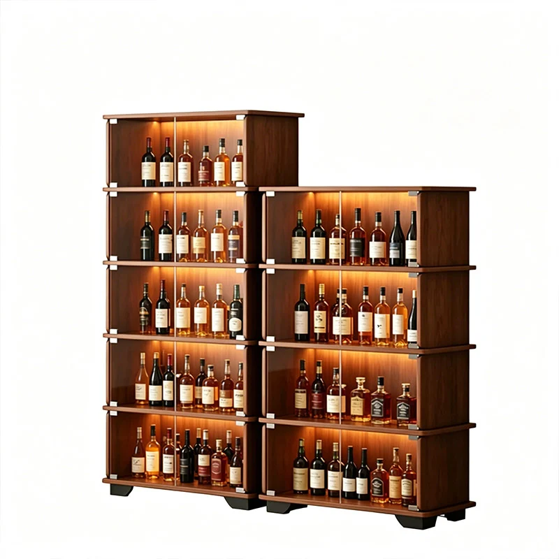
For compact, reconfigurable centre runs, a low gondola shelving system provides a useful starting point. Select the height only after checking product sizes and the view from the entrance.
3. Why should adjustable, high-capacity shelving sit on the perimeter?
Perimeter shelving holds assortment breadth and reserve-facing stock, leaving the middle for discovery. This matters because home-goods ranges often mix short candles, tall vases, folded linens, baskets, and boxed storage in one category.

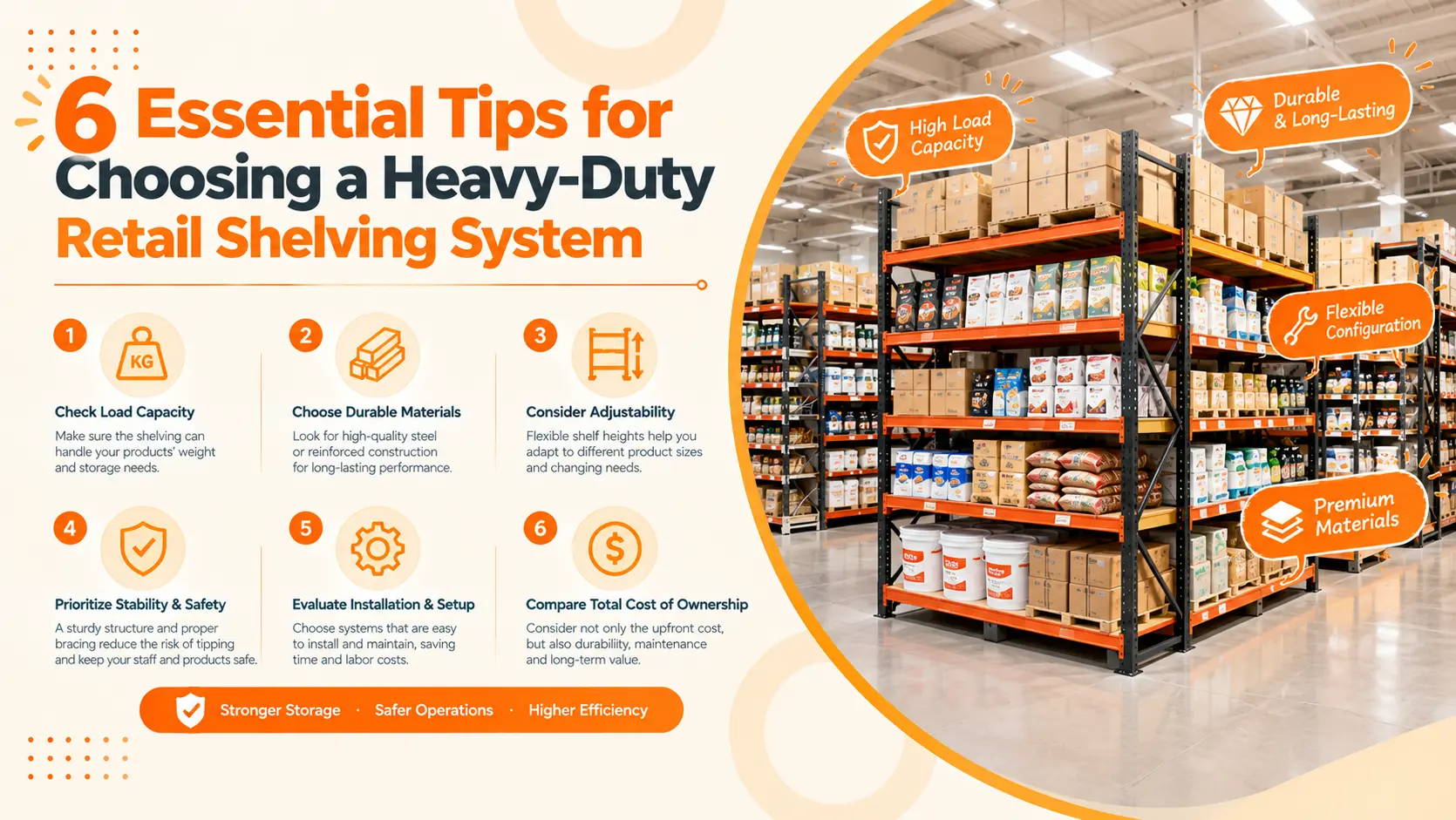
Start with product dimensions, not finish swatches. Record the tallest and deepest SKU, the heaviest loaded shelf, the number of facings, carton size, and replenishment frequency. Those inputs determine shelf pitch, depth, bracket count, and whether a base shelf should hold reserve cartons.
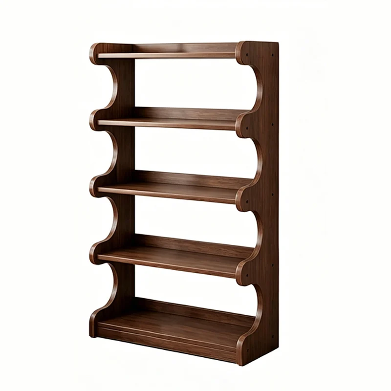
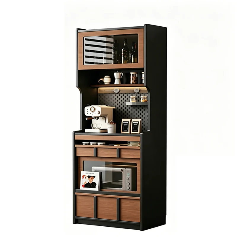
Adjustable wall bays are useful when assortments change by season. Use shelf edges and vertical dividers to keep smaller products visible. Pegboard or slatwall accessories can carry hooks, small organisers, or hanging kitchen tools when a flat shelf would hide them.
Wall units also need practical details: anchors, anti-tip measures, cleaning access, replaceable brackets, cable routes for lighting, and safe staff reach. Local accessibility, fire, and building rules determine final heights and aisle clearance. Do not treat a catalogue dimension as a universal store rule.
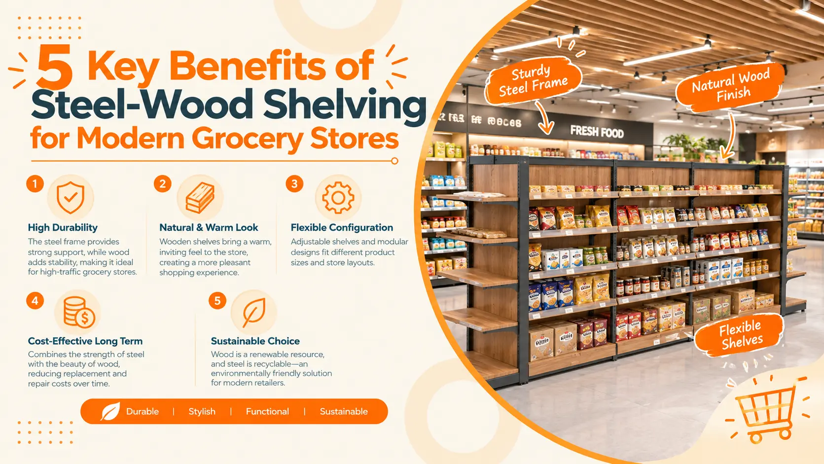
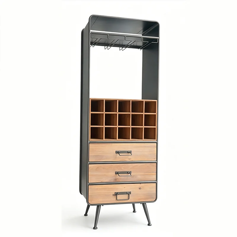
If your assortment needs a mixed steel-and-wood wall system, discuss it as custom retail shelving design. A scaled plan and product list give the factory something concrete to engineer.
4. How does customer-mission merchandising improve product discovery?
Customer-mission merchandising makes related products easier to understand together. The small-store version groups a limited set of products around a task while keeping the core category visible nearby.
Think in household missions: organise a small entryway, set up a dorm desk, prepare a guest bath, make a compact kitchen work, or host a weekend meal. The grouping gives customers a reason to notice products they might not search for by name.
Keep the category signal clear. One collection label and adjacent stock are better than a wall of promotional signs. Avoid forced pairings. A display earns its place only when the products serve the same problem, room, or routine.
Use this room-set audit before a rollout. It is original planning data you can collect for each proposed zone: record the display footprint, hero SKU, companion SKU count, stock distance, price-label visibility, and staff reset time. Compare those observations after opening; they reveal which scenes operate well, rather than merely photograph well.

| 2.4 m × 2.4 m entryway zone | Role | Where the shopper finds it |
| Bench or slim console | Hero product | On display; order route if bulky |
| Hooks and mirror | Wall solution | Adjacent wall bay |
| Baskets and labels | Supporting organisation SKUs | Low shelf or basket under the display |
| Care item or small add-on | Final useful purchase | Checkout or nearby accessory shelf |
5. How can vertical storage add capacity without making the store feel heavy?
Vertical selling space works when the shelf hierarchy is deliberate. A small retailer can put visual hero products at reachable eye level, repeat stock lower down, and controlled open space between dense groups.
Avoid treating every wall bay as a carton store. Put heavier or repeat stock in the lower zone, where staff can replenish it safely. Use the main sightline for products shoppers need to inspect: textured linens, tableware colours, small lamps, or decorative storage. Upper shelves may work for light display stock, but verify reach and maintenance procedures first.
Open bays give the eye a pause. Shadow gaps, narrow vertical divisions, and a consistent shelf-edge line prevent a long wall from reading as industrial storage. These are visual decisions, but they also make it easier for staff to see empty facings.
For sourcing, packaging, and QC considerations tied to custom units, see how to source custom retail shelving from China. Material choice, knockdown construction, and spare brackets should be decided before the first container is packed.
6. How do you make the route from display to stock obvious?
A room set creates demand, but a visible selection route makes the display shoppable. A small store should give shoppers that clarity through item tags, shelf-edge labels, and nearby stock or order support.
Keep tags short. State the product name, key size or material, price, and where to find it. A QR code can provide detail, but it should not replace a basic physical route. Shoppers should never need to scan a code merely to locate a basket shown two metres away.
For bulky goods, use a sample-plus-order model. Mark the delivery or collection process plainly, give staff a reference sheet, and reserve enough counter space for an order conversation. For accessories, keep stock close enough that the connection remains visible.
Recommended compact-store purchase pathRoom-set display → item tag → nearby collection bay → basket or order desk → checkout add-on
The right path is short but still gives shoppers room to compare. If customers keep asking where an item from a scene is stored, don’t add more decoration. Move the stock, improve the label, or reduce the number of products in the story.
7. Why does one material and colour story per display work better?
A limited material and colour story helps shoppers see product relationships before comparing individual items. The practical goal is a fixture background that supports the product.
Warm wood accents and powder-coated steel often work well together because they separate the structural frame from the tactile display surface. Matte finishes reduce distracting reflections. Lighting should show product texture and labels without creating glare on glassware or glossy packaging.
Keep seasonality in the products, small sign holders, or movable display elements. Rebuilding fixed shelves every season consumes budget and interrupts operations. A stable fixture palette lets staff reset products quickly while the store still feels current.
Test cleanability too. High-touch tables need edges and finishes that withstand routine wiping. Light finishes need a maintenance plan. Samples should be reviewed under store lighting, not only under factory lighting.
8. How can checkout become a useful final home-solution zone?
Checkout add-ons work best when they solve a small, related problem without obstructing the queue. In a compact homewares store, that principle supports a narrow, deliberate counter-side display rather than a crowded impulse bin.
Choose products with an obvious connection to the visit: hooks after an entryway display, gift wrap after a tableware purchase, care items near textiles, batteries near lamps, or small organisers near storage products. Limit the selection. Staff should be able to replenish the display without stepping into the customer queue.
Confirm counter dimensions, POS equipment, bagging space, secure storage, queue clearance, and local accessibility requirements before adding a module. A pegboard panel, narrow shelf, or small basket rail can work. It must not turn checkout into a bottleneck.
A compact promotional display can provide useful design ideas for this final zone. Apply the same discipline: one product mission, a clear price, and enough clearance for normal store operations.
What should retailers test before ordering home-goods fixtures?
Test the layout against the real assortment and daily routine before approving shop drawings. A small-store fixture plan needs product dimensions, loading requirements, restocking routes, and cleaning access alongside the visual concept.
Start with the scaled floor plan and product list. Include SKU dimensions, weights, stock depth, target facings, product-change frequency, and which lines need samples instead of floor stock. Add the shopper path, staff route, power/lighting needs, storage area, installation constraints, destination port, and requested quantity.
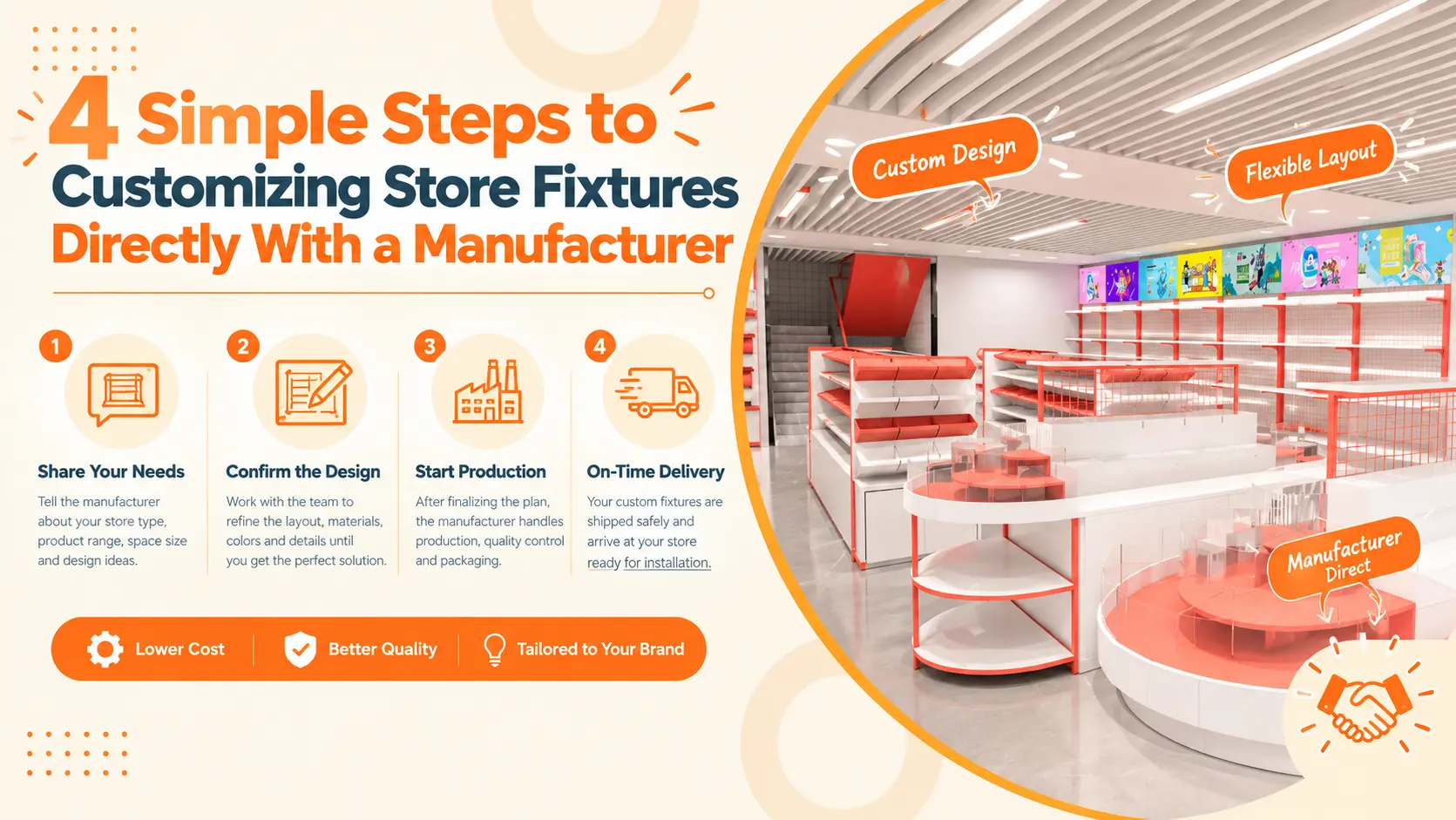
That gives the production discussion something solid to work from: the floor plan and product list, 3D layout and shop drawings, material and finish confirmation, sample or QC checkpoints, bulk production, and export packing.
What to send with a fixture enquiry
- Scaled floor plan and ceiling height
- Product list with dimensions, weights, and SKU count
- Reference images and material/finish direction
- Required quantity, destination port, target opening date, and installation constraints
Send those inputs when requesting custom store fixture design. They let the discussion move beyond a catalogue image toward shelf dimensions, shop drawings, and packing details that match the actual project.
Frequently Asked Questions
How do you display products in a small home goods store?
Combine one or two shoppable room sets with perimeter shelving for assortment depth and low central fixtures for comparison. Every item in a scene should lead to nearby stock or a defined order route.
What fixtures work best for a home decor store?
For most compact home-decor stores, adjustable wall bays, low tables, selected two-sided gondolas, and small-product accessories are useful. Choose final dimensions from product size, weight, stock depth, and changeover needs.
Can a small store use IKEA-inspired display ideas?
Yes. Use room-based storytelling, clear wayfinding, modular presentation, and an easy stock path. Don’t copy IKEA logos, product names, packaging, catalogue images, or distinctive trade dress.
Turn the inspiration into a working store plan
The useful IKEA-inspired idea isn’t a copied room scene. It’s a small store where shoppers can understand a product, compare it, find it, and decide what to do next.
- Make room sets shoppable, not merely decorative
- Protect sightlines with low, flexible central fixtures
- Put capacity and adjustment on the perimeter
- Keep the display-to-stock route visible
- Approve fixtures only after checking real products and staff routines
DAHO has confirmed 20+ years in display-shelf manufacturing, a 40,000+ m² production facility, 30+ designers, and 10,000+ completed projects.
If you’re planning a home-goods store, send DAHO a scaled floor plan, product list, dimensions, and reference images. We can then discuss fixture modules, shop drawings, material options, and export packing for the project.

Ivy is a shelving specialist at DAHO, a supermarket shelving manufacturer in China. She shares practical knowledge on retail shelving design, metal and wood fabrication, and store display systems. She helps global retailers and wholesalers understand shelving structures and choose the right factory solutions.