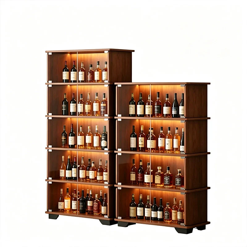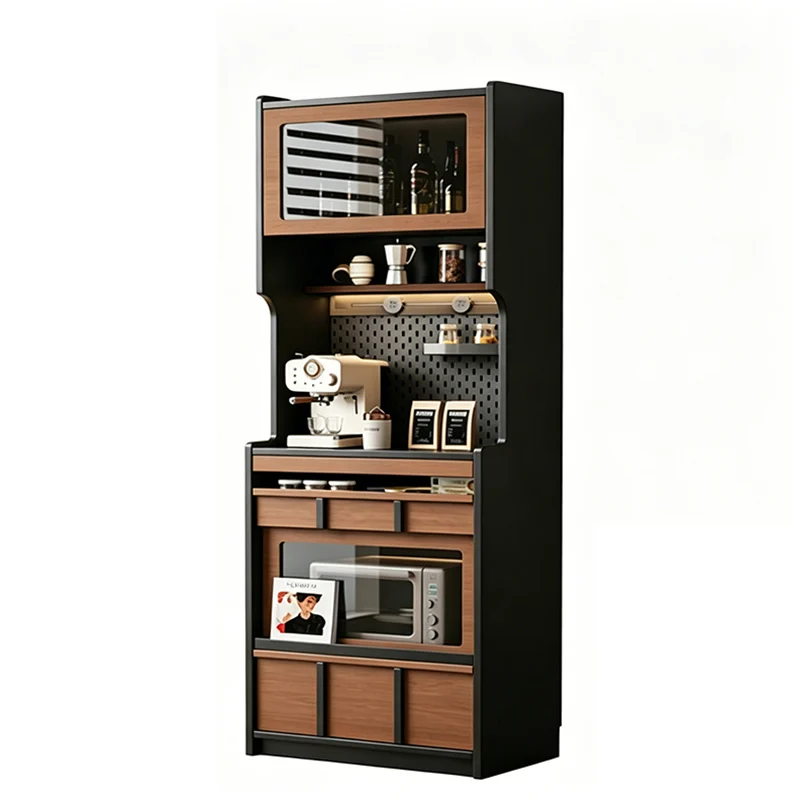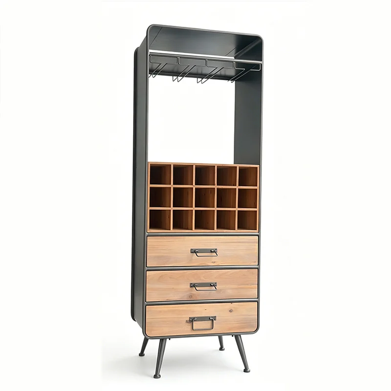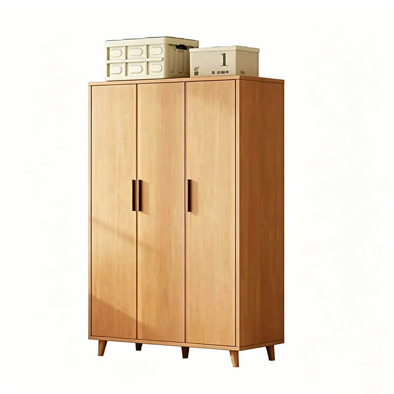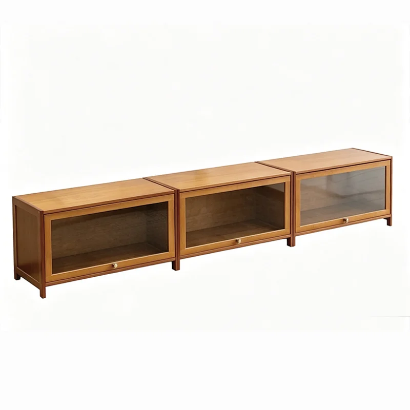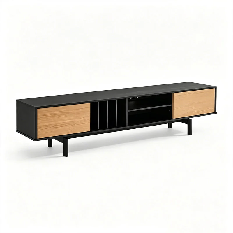
A minimalist store can hold a wide product range without feeling crowded. Muji-style store design achieves that through the relationships between products, fixtures, signs, lighting, and open space. Color matters, but it is only one part of the result.
Muji is a useful reference because its stores make ordinary products easy to browse and compare. Retailers do not need to copy pale wood or remove every sign. The transferable lesson is an information system that shows what products do, where they belong, and what a shopper might consider next.
This article uses publicly observable Muji-style design patterns as a reference.
Key Takeaways
- MUJI says it now operates more than 1,400 stores worldwide, built on a long-running no-frills product philosophy.
- Group products by customer task, room, routine, or material instead of relying on signs alone.
- Neutral wood, steel, glass, and matte finishes work only when shelf depth, lighting, replenishment, and load requirements are planned.
- Smaller stores should copy the logic, not the footprint: fewer fixture families, stronger sightlines, and deliberate empty space.
Muji-style retail is best understood as information control. It reduces competing messages while giving products more context through sequence, grouping, packaging, and material cues. A quiet store can still support discovery and cross-category shopping when those decisions work together.
For a retailer planning a new project, the first question should not be, “Which finish looks Japanese?” Ask instead: “What should a shopper understand during the first ten seconds?” That answer should shape the layout before anyone finalizes the fixture order.
1. What makes Muji-style store design effective?
MUJI began in Japan in 1980 with 40 apparel, household-goods, and food products (Ryohin Keikaku). For store planning, the useful lesson is the combination of product grouping, restrained communication, clear circulation, and functional fixtures. Restraint helps only when it improves comprehension.

Start with the visual field. Shoppers can see further into the store when fixtures do not compete with large signs, excessive color blocks, or unrelated promotions. The longer sightline helps them form a mental map before choosing a product.
Product context comes next. Household storage, travel goods, stationery, clothing, and daily necessities can be arranged around tasks or routines. Shoppers do not need to know the exact SKU before entering the category. Nearby products explain possible uses.
Consistency reinforces the system. Similar shelf proportions, finishes, labels, and presentation heights create a steady rhythm. Once shoppers understand one bay, the next one asks less of them.
Minimalism is a retail operating system
The visible style depends on less visible work: assortment planning, planograms, shelf dimensions, lighting, inventory access, and replenishment routines. Remove that groundwork and the same neutral fixtures can produce a flat, confusing store.
Use a simple practical test. Can a shopper identify the category, reach the product, compare nearby options, and understand the next useful purchase without asking for help? If not, improve the information hierarchy before adding decoration.
2. Product grouping replaces excessive signage
MUJI describes its product-development approach through material selection, process streamlining, and packaging simplification. A Muji-style approach removes some visual noise, but product grouping still needs to communicate purpose. Arrange products around customer missions and adjacent items can provide context before the shopper reads a sign.
Start with the task a shopper is trying to complete. Storage boxes can sit beside dividers, baskets, labels, and closet accessories. Travel goods can sit near packing organizers. Stationery can be grouped around writing, study, desk organization, or gift-giving instead of being split into isolated product types.
This arrangement also supports cross-category discovery. Someone who comes for one storage box sees the accessories that make it useful. That does not guarantee a larger basket, but it creates a better decision field.
| Merchandising approach | Shopper clarity | Cross-category discovery | Dependence on signage |
| Isolated categories | Medium | Low | High |
| Brand-block shelving | High within brand | Medium | Medium |
| Use-case grouping | High for the mission | High | Low to medium |
Editorial planning framework. These ratings are not measured sales results; the final arrangement should be tested against the store’s product list and customer missions.
The fixture has to support the grouping. A deep shelf can separate products visually even when the planogram is correct. Shorter shelf depths, clear vertical divisions, and consistent product-facing heights keep the display legible.
Retailers planning larger grocery or daily-needs spaces can apply the same principle through supermarket layout strategies: define the shopping mission first, then use fixtures to make the sequence visible.
3. Why do neutral materials and quiet fixtures matter?
MUJI identifies material selection as one of its three product-development principles. In a retail fixture project, neutral materials work when they give product texture, packaging, and function a stable background. The fixture still needs specific decisions about steel, wood, finish, joints, loading, and cleaning.
Wood adds warmth and a domestic feel. Powder-coated steel provides structure, adjustable support, and a durable frame. Glass can improve visibility for selected products, while matte laminates create a controlled color field. None of these materials is automatically minimalist. Their value depends on proportion, edge treatment, finish consistency, and how they frame the merchandise.
The fixture should recede, not disappear
A fixture that recedes still has a job. Shelf edges should be easy to read, brackets should support the intended load, and lighting channels should be serviceable. Surfaces also need to tolerate repeated cleaning and minor impacts without turning the store into a maintenance project.
Contrast matters too. If every surface has the same tone, product hierarchy can disappear. A retailer may need a darker base, a brighter product-facing level, or a material change to mark a new category. Restraint is not the absence of hierarchy. It is hierarchy with fewer competing signals.
4. How does the layout control the pace of browsing?
A retail layout controls browsing pace through sequence, not through decoration. The most useful sequence is usually orientation at the entrance, a broad category view, a focused comparison zone, and a transition toward another related need. That sequence gives the shopper direction while leaving room for exploration.
The entrance should not be filled immediately with tall shelving. A short decompression zone lets shoppers adjust to the store and see the first category landmark. Central fixtures can then carry the assortment while wall bays provide capacity and a stable perimeter.
Two-sided gondola shelving systems can work in this setting when their height preserves sightlines. They create useful display surface in the center of the store, but they should not form a maze. The correct height depends on the product, store size, accessibility requirements, and the sightline the layout needs to protect.
Use a store-audit checklist before copying the look
Before adopting a Muji-style approach, audit one representative store or test zone. Record aisle width, fixture height, shelf depth, product-facing density, sign frequency, material changes, and the time needed to replenish a bay. This is a planning checklist, not evidence that one location represents every MUJI store.
The useful comparison is between what the shopper sees and what the fixture brief must specify. If a display looks calm only because reserve stock, cable routes, and cleaning tools are hidden outside the frame, the operating plan needs to account for them before production.
5. What can smaller stores copy without copying Muji’s scale?
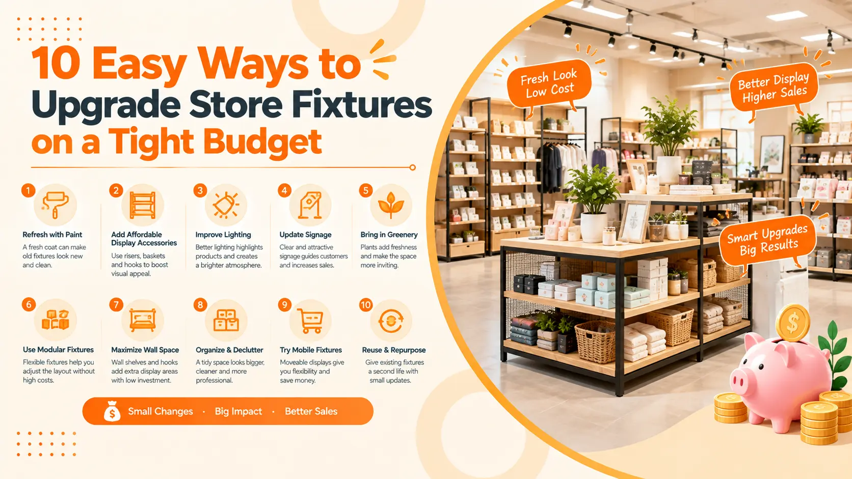
Smaller stores should copy the rules, not the footprint. A compact store can still use one consistent wall fixture family, one modular central unit, one feature table or end cap, and one checkout add-on zone. The goal is a readable system, not a miniature flagship.
For a compact store, start with the strongest customer mission and protect one clear sightline from the entrance. Use the wall perimeter for capacity, keep the center flexible, and avoid introducing too many fixture styles. In a larger compact format, a short central run and one rotating feature point can be tested if circulation remains clear.
The temptation is to spread empty space evenly. That usually wastes valuable floor area. Put it where a shopper needs to pause: at the entrance, before a new category, around a hero table, or beside a product-comparison zone.
The same principle applies to a pharmacy beauty area, stationery shop, daily-necessities store, or home-goods boutique. The product mix changes. The need for clear grouping, reachable presentation, and staff access does not.
Before ordering custom fixtures, prepare the product list and floor plan. A manufacturer can then check shelf dimensions, bay widths, storage needs, and customer movement. The customization process should begin with the information that determines the fixture, not a finish sample chosen in isolation.
6. Which fixture specifications make the style work in daily operations?
Minimalist stores depend on production details that shoppers may never notice directly. The finish is visible, but the specification determines whether the store remains usable. Shelf depth, hardware, lighting access, load planning, and replacement parts all affect the store after opening day.
Start with shelf depth. A shelf that is too deep pushes products into shadow and creates dead stock at the back. A shelf that is too shallow may reduce capacity or make unstable products difficult to present. The right dimension depends on SKU size, facing count, load, replenishment method, and the shopper’s reach.
Height controls both access and sightline. Wall shelving can carry more capacity, while central gondolas should preserve enough visibility to help shoppers orient themselves. A feature table can slow the pace, but it needs clearance around it and a simple story that does not require a large sign.
Material selection should follow use. Powder-coated steel works well for structural frames, adjustable supports, and hard-wearing display bays. Wood can provide warmth and a domestic feel. Tempered glass may suit selected presentation areas. Drawers, cable routes, removable panels, and replaceable trays make the visual system easier to maintain.
Manufacturing questions buyers should ask
- Are the dimensions, materials, finishes, and load requirements shown in approved shop drawings?
- Can shelves, brackets, graphics, and display trays be replaced without rebuilding the whole bay?
- Is lighting accessible for maintenance, with glare controlled at the product face?
- Does the packaging protect corners, glass, panels, and hardware during export shipping?
- Has the layout been checked against replenishment, cleaning, accessibility, and staff movement?
A buyer should ask for documented quality-management certification, relevant product-test reports where required, and project-specific evidence such as approved shop drawings, material samples, and QC records. General company credentials are useful, but they do not substitute for project-specific verification.
| Fixture type | Best use | Buyer priority |
| Wall shelving | Perimeter capacity and stable category blocks | Load, adjustability, reach, replenishment access |
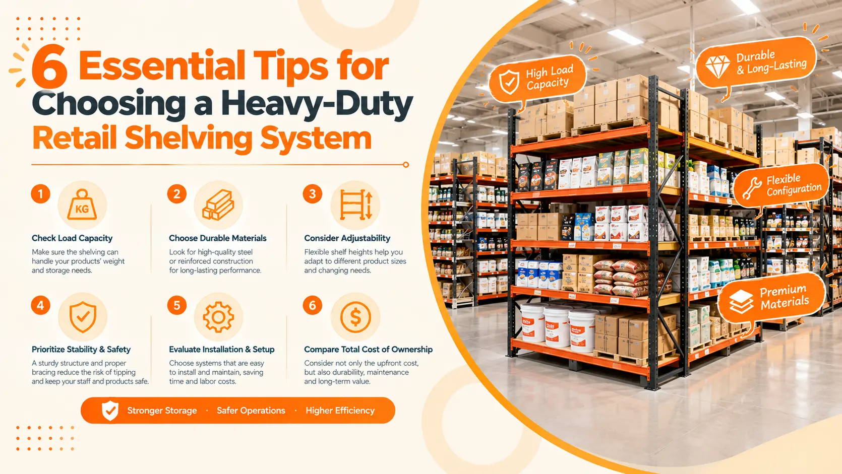
| Modular gondola | Central browsing and two-sided merchandising | Height, sightlines, bay connection, knockdown packing |
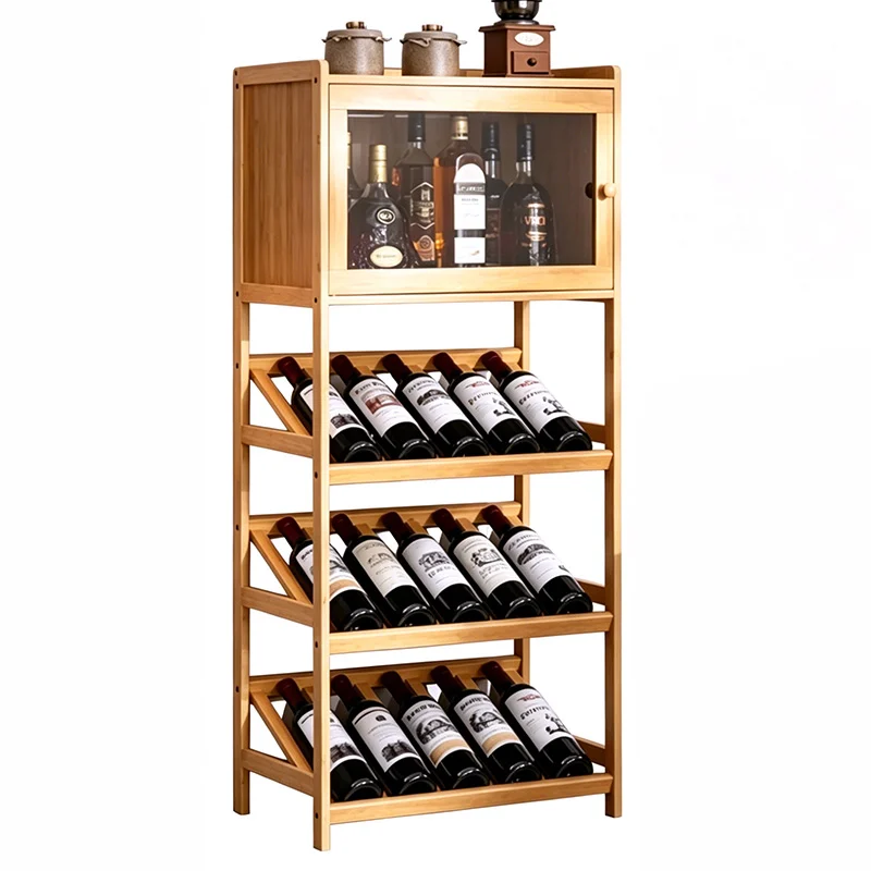
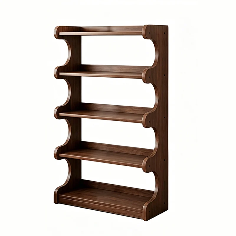
| Mixed wood-metal unit | Warmth with a durable structural frame | Finish consistency, joints, cleaning, replaceable parts |
These are planning distinctions, not universal specifications. Final dimensions depend on the product list, local standards, store format, and approved shop drawings.
For buyers sourcing from China, the fixture brief should also cover sampling, production timing, QC, packaging, and container loading. DAHO’s guide to source custom retail shelving from China can sit beside the design discussion because procurement decisions affect the final store result.
A common risk in minimalist projects is a beautiful first photograph followed by difficult daily operation. Shelves can be too deep, storage can be missing, testers or samples can be difficult to clean, and seasonal stock can have nowhere to go. Good shop drawings prevent that gap by treating maintenance and changeover as part of the design.
7. How should retailers adapt the Muji idea for their own brand?
The design principles can be adapted by retailers with very different assortments, price points, and service models. Borrow the discipline of the system, then add the color, category logic, promotional rhythm, and price cues your customers need.
Use this six-step process:
- Audit customer missions. Write down why shoppers enter and which products complete each mission.
- Map product relationships. Group products by task, room, routine, material, or complementary use.
- Draw circulation and sightlines. Mark the entrance, first landmark, comparison zones, transitions, checkout, and staff routes.
- Choose a small fixture family. Combine wall bays, central modules, feature tables, or end caps only where each has a clear role.
- Test one zone. Review product reach, sign dependence, replenishment time, cleaning access, and shopper questions.
- Approve drawings before production. Confirm dimensions, materials, lighting, loading, packaging, and installation details.
The adaptation should feel like your brand. A grocery retailer may need stronger price communication and faster replenishment. A home-goods store may need more room for tactile comparison. A specialty boutique may need service space. Minimalism should clarify those differences, not hide them.
When the layout is ready, send a manufacturer the floor plan, product list, target dimensions, material references, and any lighting or load requirements. That information is enough to start a useful fixture conversation and a project-specific quote.
Frequently asked questions
What is a Muji-style store design?
A Muji-style store design is a restrained retail system built around clear circulation, grouped products, neutral materials, limited visual noise, and functional fixtures. There is no universal specification for every store. Treat the style as a planning reference, then adapt it to the merchandise and local requirements.
Why does Muji use minimalist store design?
Minimalist design can make product relationships and use cases easier to understand by reducing competing visual messages. It does not prove a sales effect by itself. The result depends on assortment, planogram, lighting, fixture height, and signage. A neutral store without those controls is merely sparse.
How can a small shop create a Muji-style layout?
Start with one clear customer mission, one wall fixture family, one flexible central unit, and one feature or checkout zone. This is a practical starting framework, not a universal store standard. Protect sightlines at the entrance and place empty space at decision points. Fewer fixture types make the visual rhythm easier to maintain.
What materials work for minimalist retail fixtures?
Powder-coated steel, wood, glass, and durable laminates can all work. The choice depends on load, cleanability, budget, product weight, lighting, and replacement needs. Confirm those requirements in project drawings and samples before production.
Can a manufacturer create custom Muji-style store fixtures?
Yes. A buyer should provide a floor plan, product list, dimensions, material and finish references, load requirements, lighting needs, and installation constraints. Shop drawings, sampling, QC inspection, packaging, and spare-parts planning matter as much as the visible finish.
Conclusion
Muji-style store design works because several quiet decisions reinforce one another. Product grouping reduces the need for excessive signage. Neutral fixtures frame the merchandise. Sightlines and circulation make the store easy to understand. Shelf depth, lighting, loading, cleaning, and replenishment keep the appearance useful after opening day.
The strongest adaptation is not a copy of MUJI’s color palette. It is a store where every bay has a customer purpose and every fixture supports the way the store operates.
- Group products by task or use case
- Protect sightlines and place empty space at decision points
- Specify materials, dimensions, lighting, and load together
- Test one zone before committing to a full rollout
To plan the next step, send DAHO your floor plan, product list, target dimensions, and reference images through custom retail fixture design.

Ivy is a shelving specialist at DAHO, a supermarket shelving manufacturer in China. She shares practical knowledge on retail shelving design, metal and wood fabrication, and store display systems. She helps global retailers and wholesalers understand shelving structures and choose the right factory solutions.